UX | UI
Your Ford. Your Way.
Empowering users with an improved end-to-end configurator experience
Ford Motor Company | 24 Weeks
Overview
Having led the design work on Ford’s next generation configurator, the experience was rolled out to all passenger vehicles in 2020. This work stream aimed to revisit and better the experience. It was anticipated that improving the configurator and enhancing the user’s perception of the brand would see a flurry of online sales in 2021 following the launch of the full buy online experience.
The Brief
Ford’s end-to-end configuration journey, which launched as an MVP, needed to be improved holistically and provide users with a greater level of confidence when building their vehicle. Making the necessary revisions would communicate the product offering clearly in a sound interface that users could progress through with ease.
My Role
This was a proactive piece of work that was completed remotely. I led both the UX and UI and took charge of a number of small, remote tests. User interviews were run by an external agency.
The Problem
Ford’s buy online journey was in danger of becoming the siloed experience it once was
In July 2020, Ford’s next generation configurator was put through its first round of comprehensive user testing since its launch. While there had been a significant increase in completions, a number of issues hindered the experience. The lack of content was a recurring theme, while outdated UI meant Ford’s buy online journey was in danger of becoming the siloed experience it once was.
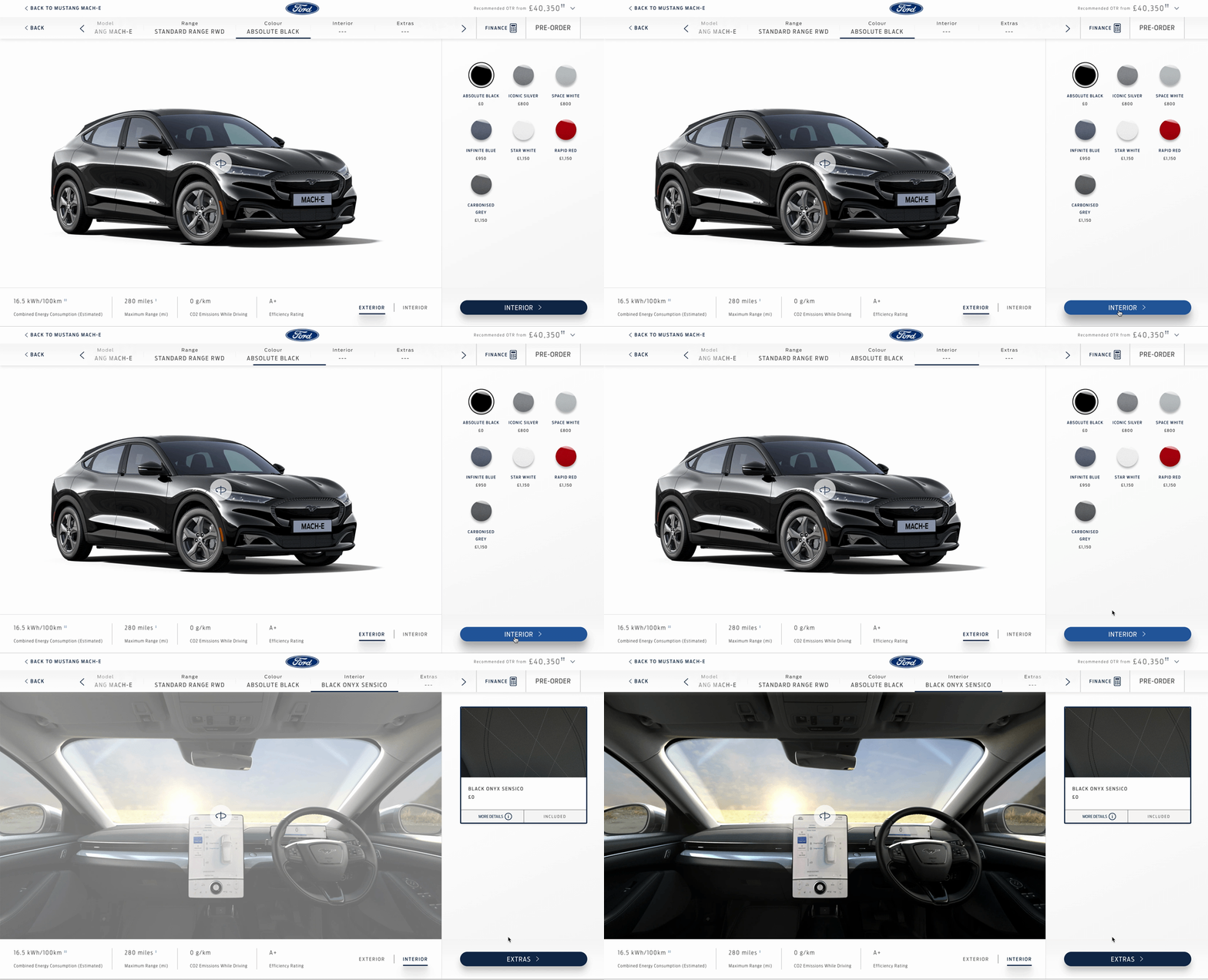
A selection of user research insights and screenshots of the existing experience
Key Outputs
Inability to find relevant information and make decisions
Users were unable to find Information on such as specification breakdowns, as well as find an overview of their build. As a result, users didn’t feel as though they were ready to proceed. They were left scratching their heads asking where this information was hiding.
Lack of understanding and communication
At several points in the journey, users didn’t understand what they were asked to select or choose between. They struggled to identify what was included with their selected model, while users wanted to see more details on features. In addition to this, some terminology was deemed too technical and difficult to understand.
Personalisation hindered by clunky navigation
The ability to move between different stages of the configurator and tweak selections seamlessly was hindered by the navigation. Combined with poor page transitions and long item names displayed in the horizontal bar, the convoluted interface discouraged a personalised, free-flowing, independent experience.
Ideate & Define
A mindful approach and interrogating decisions resulted in clear and cogent recommendations
Using the key themes and feedback extracted from the user research, I created a criteria that I scored a total of 10 configurators against. While this competitor analysis provided an insight into what worked well and what didn’t, it ensured Ford’s experience was scrutinised with questions being asked on how it could become ‘best in class’. This approach allowed me to compile a list of must haves and consequent improvements to explore.
Due to the project being a proactive piece of work, I had the opportunity to define my own workflow.
Phased UX was adopted at this stage to ensure the must haves were implemented into the existing experience effectively, while it also meant I could manage the expectations of the client and the consequent development effort. Focusing on the mandatory steps, the first phase started with the necessary changes such as alignment and content grouping and aimed to stick closely to our current build. As I moved through the explorations, I looked to adopt a more creative, yet functional approach.
Competitor analysis matrix focusing on powertrain step
Competitor analysis InVision board
Case Study
Selecting a model
Key areas of interest included improving comparability between models, legibility and ensuring the experience was visually appealing. Additional content would help users make more informed decisions, while guiding the user through mandatory steps would improve a user’s perception of where they were in the journey and what they needed to do.
Phase 1
Content aligned, clear pricing, content grouped, improved access to ‘more details’
Phase 2
Page length utilised, scroll within card removed
Phase 3
Emphasis on vehicle image and key data points, open up page to reduce empty space
Phase 4
Guide and educate the user using emotive copy, add supporting content
Breaking the experience down step-by-step and phasing the UX provided a solid foundation, which would be refined through further testing and consequent iterations. Being critical of my own work and ensuring the user was the driving force behind the recommended changes meant I was able to offer clear and cogent recommendations.
Key Challenges
Avoiding a broken UI when generating a finance quote
For legal reasons, the ability to generate monthly prices had been removed from the early stages of the experience, while a number of European markets were all facing a broken interface due to the multiple values needing to be displayed. I worked closely with Ford Credit and their legal team to fully understand requirements and identify key components so I could then start afresh.
Generating a finance quote in Spain resulted in a broken header
Reintroducing the ability to generate a finance quote came down to whether or not it was clear what vehicle the quote was being calculated against. With this in mind, a selected state was adopted in the early stages, while I recommended moving away from the existing pricing drawer and adopting an overlay that displayed a clear overview of the vehicle.
Live finance calculator
New finance calculator
Accommodating up to 5 prices was always going to be difficult, no matter what device you were looking at. In order to overcome this challenge, I crafted a full-width component for smaller devices, while the desktop header was totally reworked. After multiple tests and iterations, the new components integrated into the new UI seamlessly, with the changes being well received by Ford Credit.
Pricing placement was tested on both mobile on desktop with navigation incorporated into the mobile tests
New header demonstrating how it scales to accommodate up to 5 values
Overcoming tricky translations and mysterious additions from IT
Since launching in 2019, the configurator’s navigation had experienced a series of updates that had left it looking a little worse for wear. Revisions looking to accommodate longer languages, as well as mysterious additions from IT seemed to be causing more problems than they were solving.
Germany faced issues with long item names spanning the width of the navigation, while IT had implemented a back overlay
Testing, analytics and the competitor analysis played a major role in the navigation’s development with various elements such as the user’s selections removed. While vertical navigation was explored and tested, horizontal navigation was a significant winner with the overall feeling being that it was quicker to move through, easier to see everything and had a clearer hierarchy.
Horizontal and vertical navigations were tested on mobile and desktop with the horizontal nav coming out on top
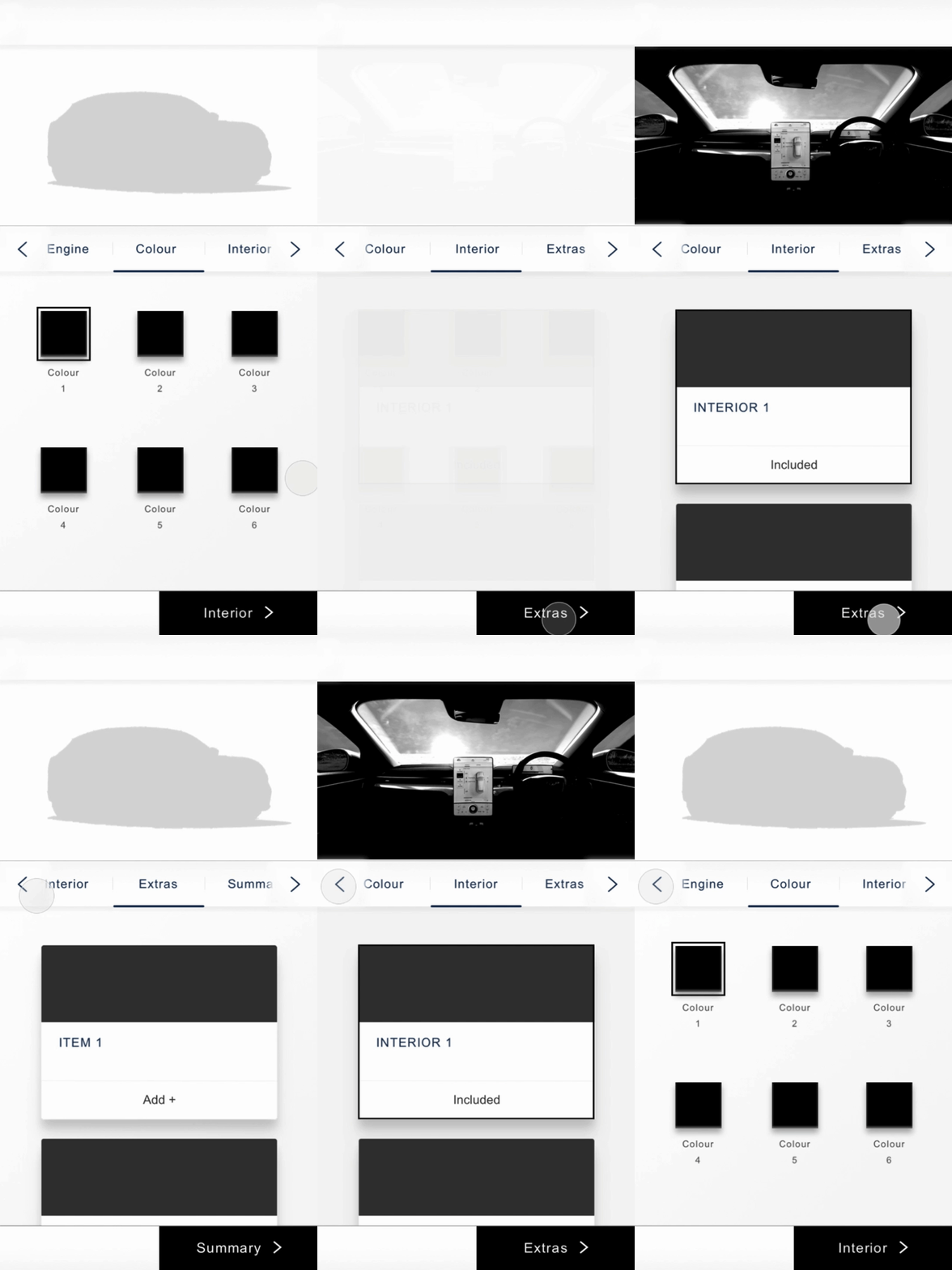
Further testing allowed for the navigation to be refined with the most noticeable change being it’s introduction to the mandatory steps. It’s inclusion from the outset meant the expectations of the user would be managed, while on smaller breakpoints, navigational chevrons, in addition to the next step CTA, would provide an effortless way of moving through the experience.
The navigation was decluttered with clear actions implemented to improve navigability
Ensuring the experience accommodates all inventory scenarios, consistently
With the full ecommerce journey due to launch for all passenger vehicles in 2021, Ford wanted to fully integrate available stock into the configurator experience. In doing so, users would be able to purchase their configured vehicle or a vehicle with a similar specification.
Previously, a notification banner had blocked users from completing their configuration with a link through to Ford’s inventory showroom
Having launched a stand alone inventory showroom in 2020, I wanted the summary page to work harder and communicate the relationship between the 2 functionalities. Unlike previous inventory integration attempts, this approach would ensure the user journey was as consistent as possible, regardless of whether an exact match was available.
The majority of users failed to understand concepts exploring an inventory/summary integration
A selection of user research insights looking at both the new and existing summary page
Various concepts were explored and tested, including an Amazon-inspired module displaying inventory cards, however these attempts appeared to create more problems than they were solving. Instead, I saw the summary page as a ‘jumping off point’ so wanted to keep it simple. The eventual solution satisfied the need to upsell existing stock with the availability communicated concisely in a new right-hand-rail, alongside a clear set of dynamic actions depending on the scenario.
A new component would dynamically accommodate all inventory scenarios, along with relevant secondary actions
The Solution
In a project that was driven by testing and analytics, the foundation of the next generation configurator remained, with each step broken down and enhanced in such a way that offered a more independent, educational and informative experience.
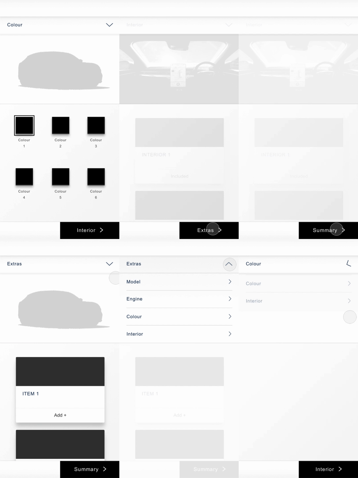
Flows demonstrating the new and improved next generation configurator experience
Clearer cards, easier choices
Product cards were reskinned with a key focus on legibility, grouping and comparability. Content was introduced to help guide and inform users, while the introduction of selected states meant the navigation could be included from the first step. This would allow users to move through the journey independently with the option to access the summary at any point.
Previous Design
New Design
An enriched customisation experience
An array of improvements were made to the customisation phase, which improved the overall look and feel. Components such as product cards and the 360 indicator were enhanced, while a studio background was introduced to offer a greater level of depth. Legal data points such as emissions were now found in a new vehicle specification component further down the page.
Previous Designs
New Designs
More extras, more details, more space
A full page format was adopted at the extras stage of the experience to enhance browsability and reduce interaction cost. New overlays were introduced, which accommodated a clear feature breakdown to help users understand various items within packs.
Previous Design
New Design
Making the summary work harder
Accessible from any stage of the experience, the new-look summary adopted the same split seen in previous steps with key inventory scenarios and relevant secondary actions captured in a specific container. A new configuration accordion provided a clear route back to each step, while the vehicle specification was condensed depending on the device to reduce cognitive load.
Previous Designs
New Designs
Reflection
Being given the responsibility and freedom to take charge of this project has given me confidence in my ability to own a process and bring a product to life. I emerged myself in the testing side of things and having taken charge of briefings, observed sessions and collated data, watching how the researchers conducted themselves and ran the sessions was really insightful. The project was a great excuse to make use of our remote user research tools and offered plenty of experience after I ran multiple micro tests alongside our user researcher.
Next Steps
Until it’s proposed launch later in 2021, I will continue to oversee any design related work for the new and improved configurator. In the meantime, further optimisations that affect the following steps in the purchase journey, will be looked at internally. We’ll assess how certain areas can be improved with a view to adopt a similar mindset and approach seen in this particular project.
Want to see more?
Redefining Sky TV
Sky | 24 Weeks
Revolutionising Ford Sales
Ford Motor Company | 56 Weeks


