UX | UI
Revolutionising Ford Sales
Crafting a seamless pre-order journey for Ford’s new Mustang Mach-E
Ford Motor Company | 56 Weeks
Overview
The all-new, all-electric Mustang Mach-E was unveiled in November 2019 and Ford wanted to give consumers the opportunity to pre-order the vehicle online. I played an integral role in Ford’s transition into a global ecommerce platform that would see a major change in the way users interacted with the website, and more significantly, how Ford customers purchased vehicles in future.
The Brief
To create a new end-to-end purchase journey that allows consumers to build and pre-order their perfect Mustang Mach-E from the comfort of their own home. The platform, which would need to be scalable, would empower the user on their sales journey by providing easy access to product information, content and data in a clear and structured user interface.
My Role
I led the UX and UI on the project and collaborated with numerous designers and BA’s on both the EU and US team to build out the full pre-order experience.
The Problem
Ford isn’t set up to be a consumer first, digital retailer
Ford’s previous online store
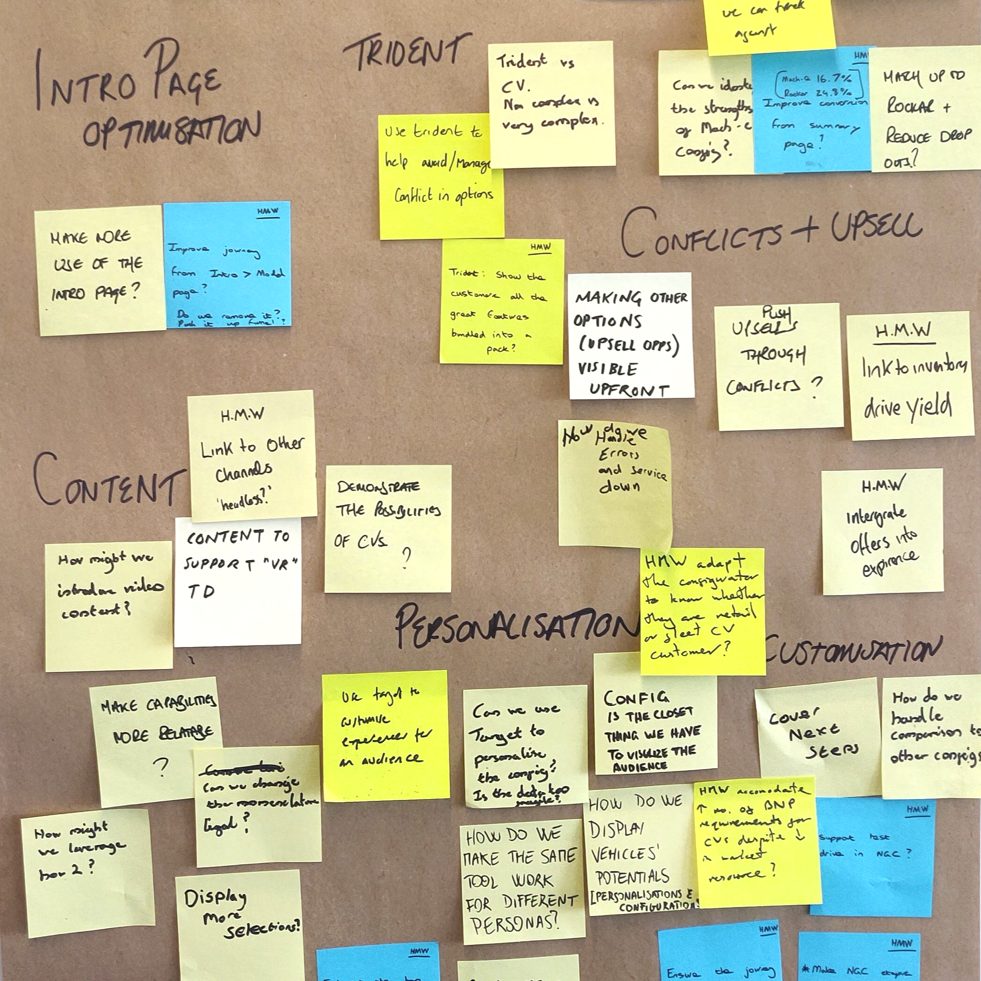
The discovery phase of the project saw multiple sprints dedicated to uncovering key themes on Ford’s third party Buy Online platform and generating personas. I used methods such as empathy mapping and clustering as a way of translating existing data, from Psyma and recent user testing, into a range of key insights.
Along with these findings, continuous benchmarking provided inspiration and helped identify what worked well and made ecommerce websites enjoyable to use, with a key focus on sites that offered similar features to Ford.
A collection of artefacts from discovery, including competitor examples, empathy maps and persona
Key Themes
Lack of support throughout
From tailored searches to model comparisons, when working through discovery into buy online, there was a clear lack of supporting content. This resulted in users being unable to fully understand the product offering and left users frustrated as they couldn’t find what they were looking for.
Siloed customer experience
Those who were able to navigate from discovery to buying online felt as though they were being pushed to a different website. The lack of visual continuity in the look and feel between the steps, as well as the poor navigability, caused uncertainty and confusion.
Poor mobile experience
The mobile experience was called out by multiple users as being unintuitive due to its non-linearity. While convenience meant users made most of their purchases on their phone, working through the configurator proved difficult with key actions often overlooked and others causing confusion.
Ideate & Define
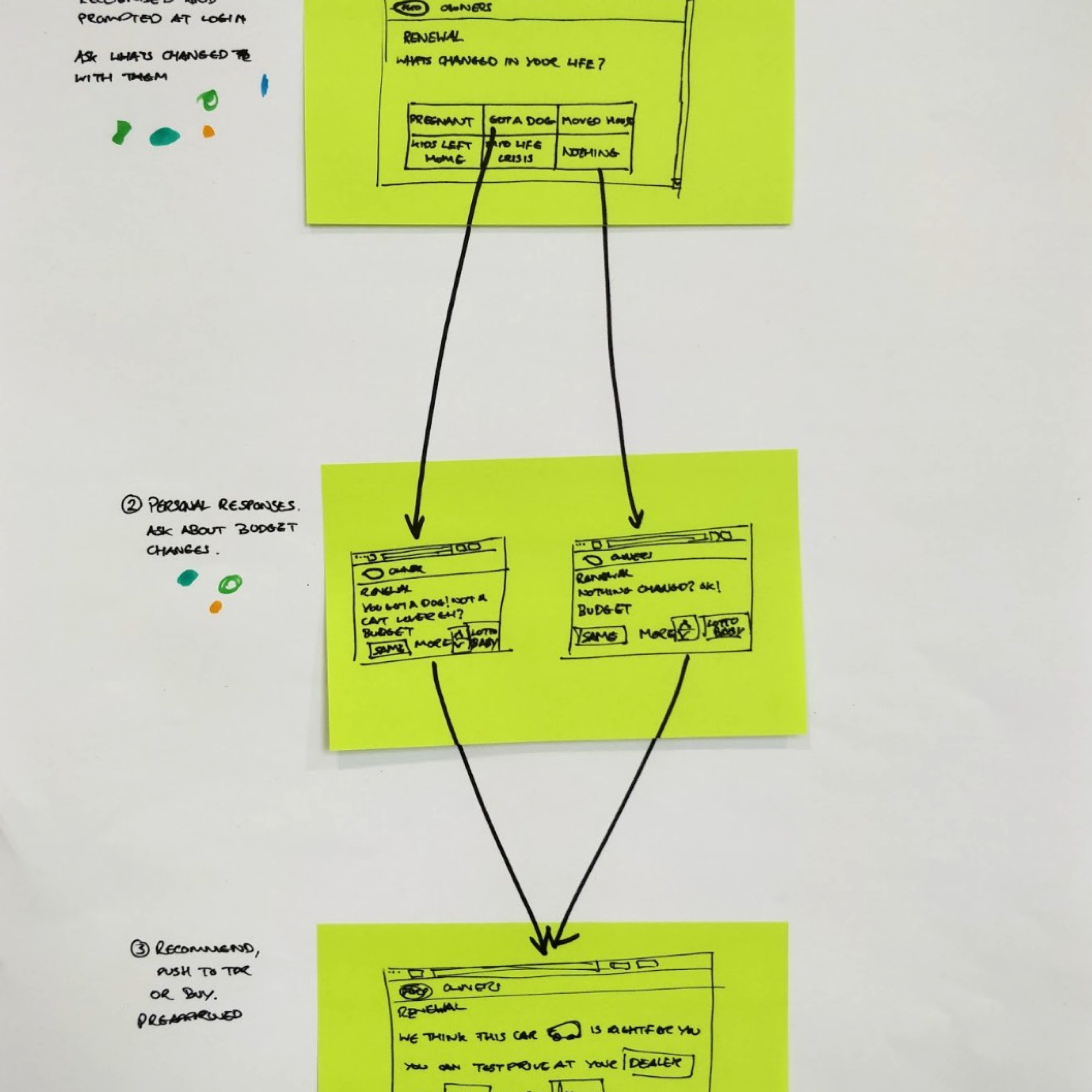
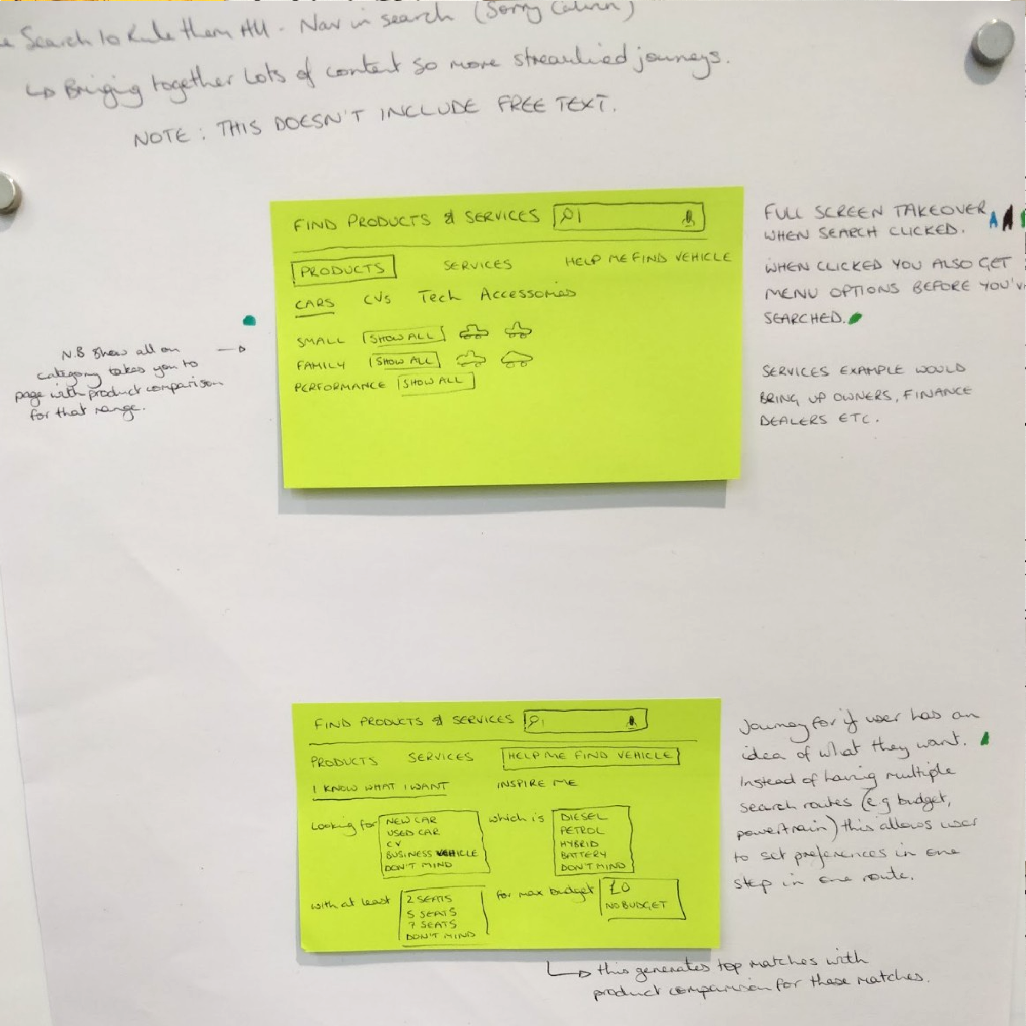
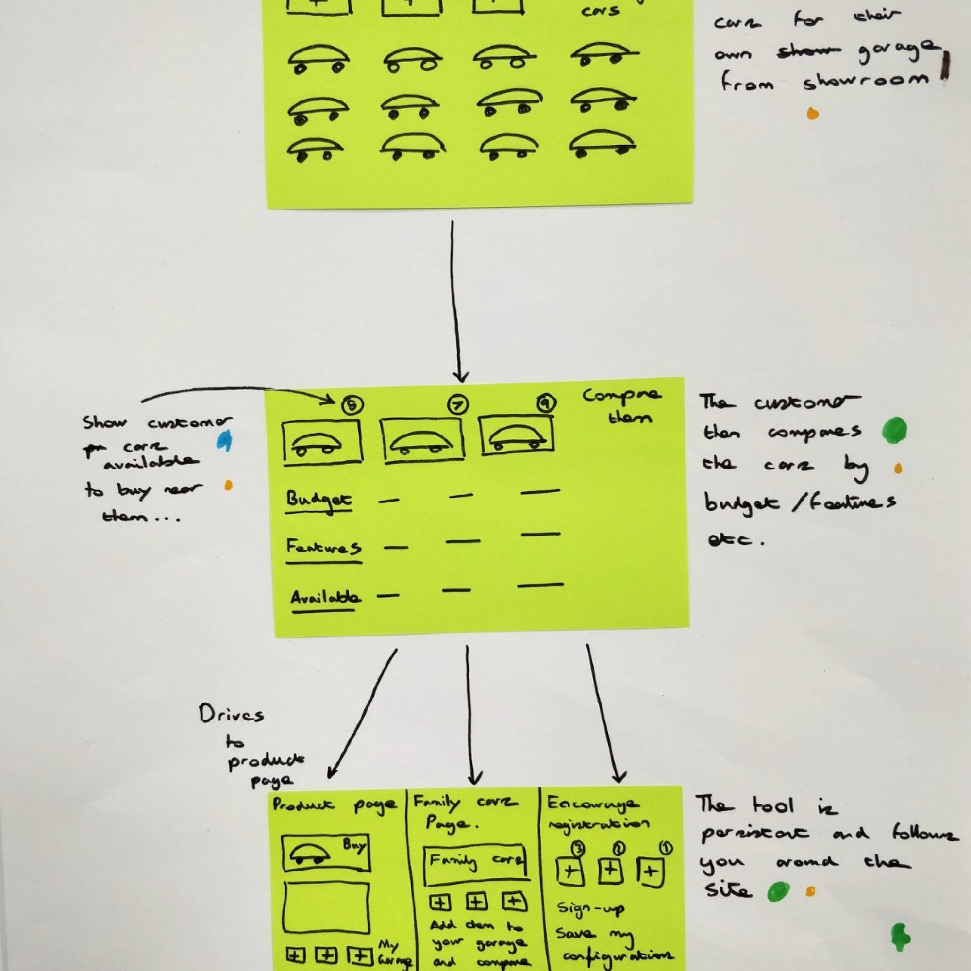
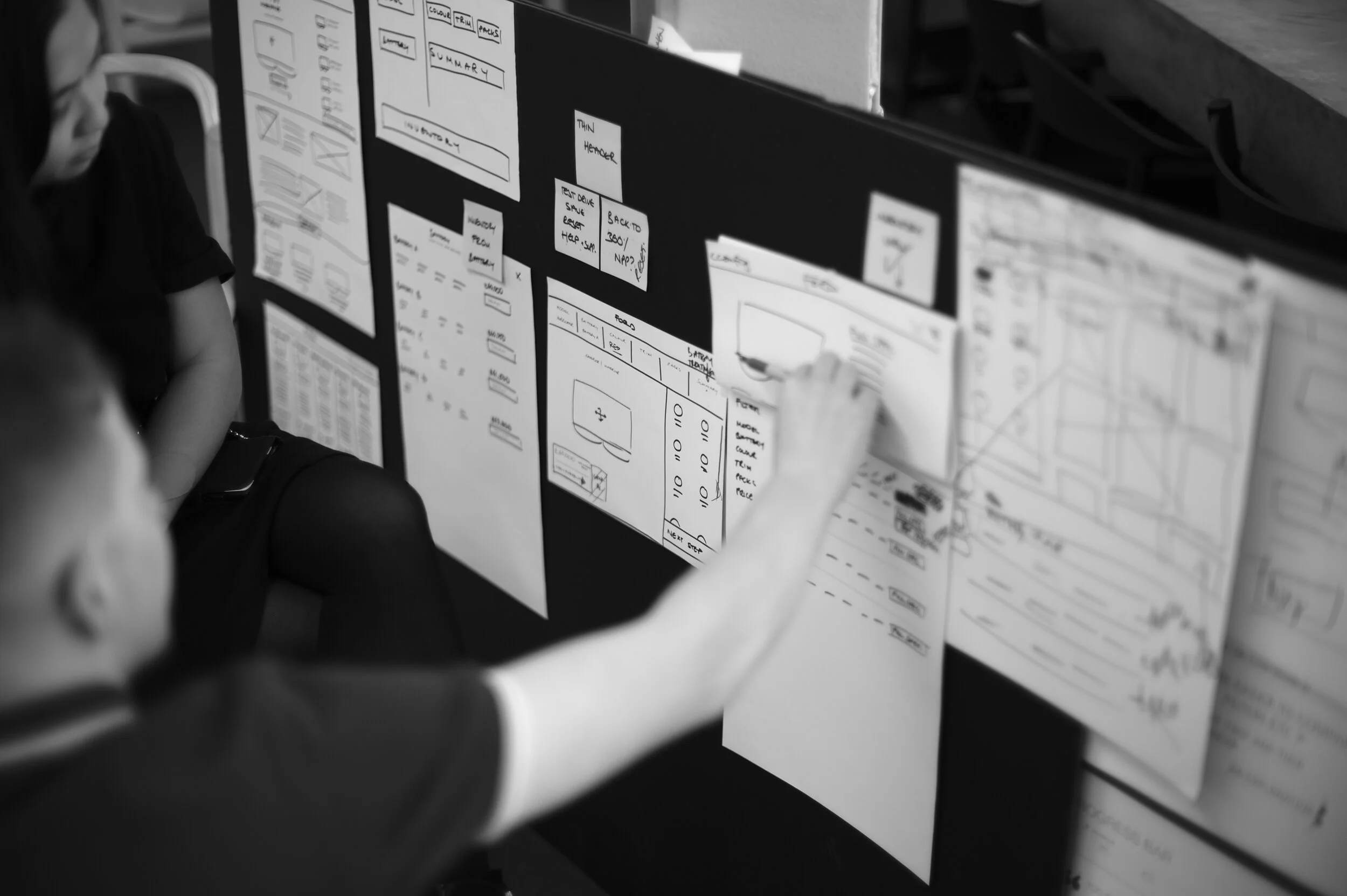
Ecommerce would be a new part of Ford’s website that would be built from nothing and so it was a good opportunity to take a more creative, open-minded approach that would allow for everyone in the team to contribute. Having identified the key areas of search, discovery and purchase, methods including “How We Might”, Crazy 8’s and Solution Sketch were put into practice with dot voting used to help decide on the ideas that would be investigated further.
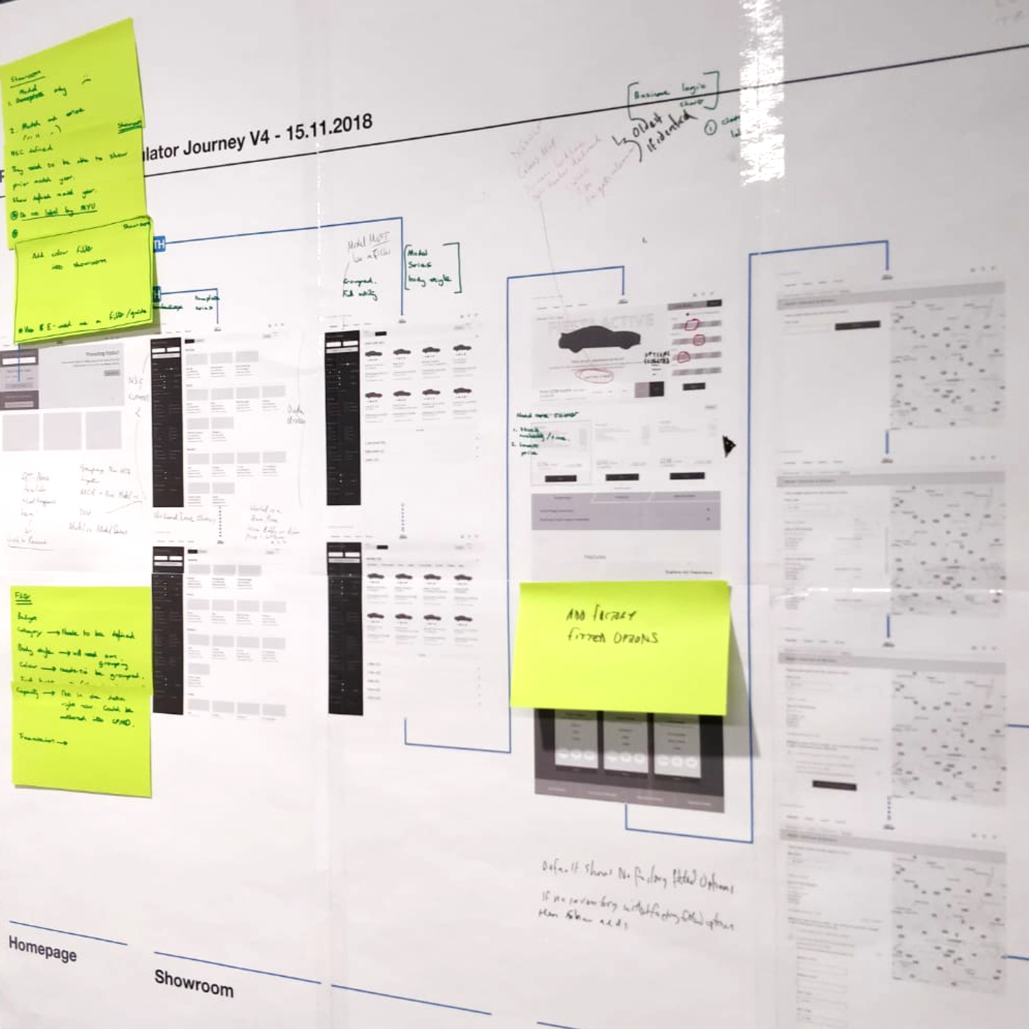
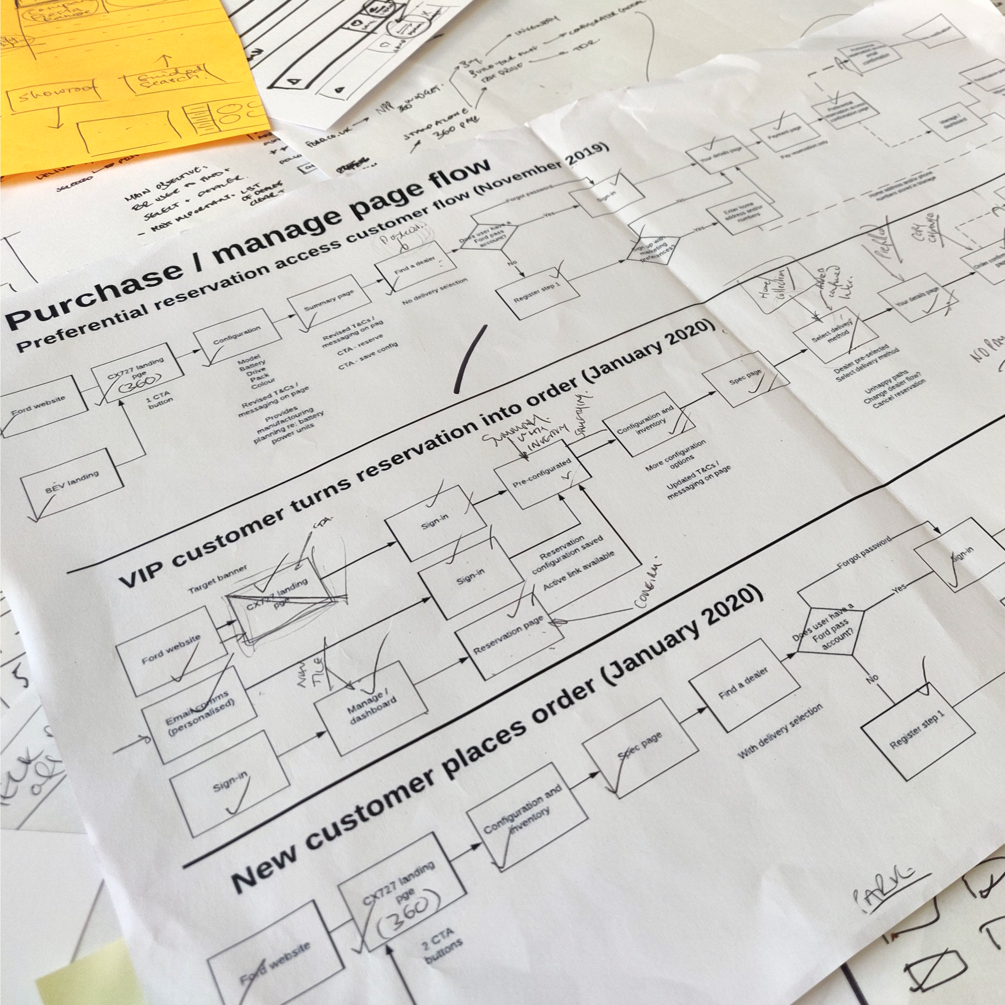
Ideation and journey exploration was exhaustive during the define stage due to the amount of business rules and requirements
Outputs
Lifestyle ‘Help Me Choose’ tool
Budget based search leading into a showroom
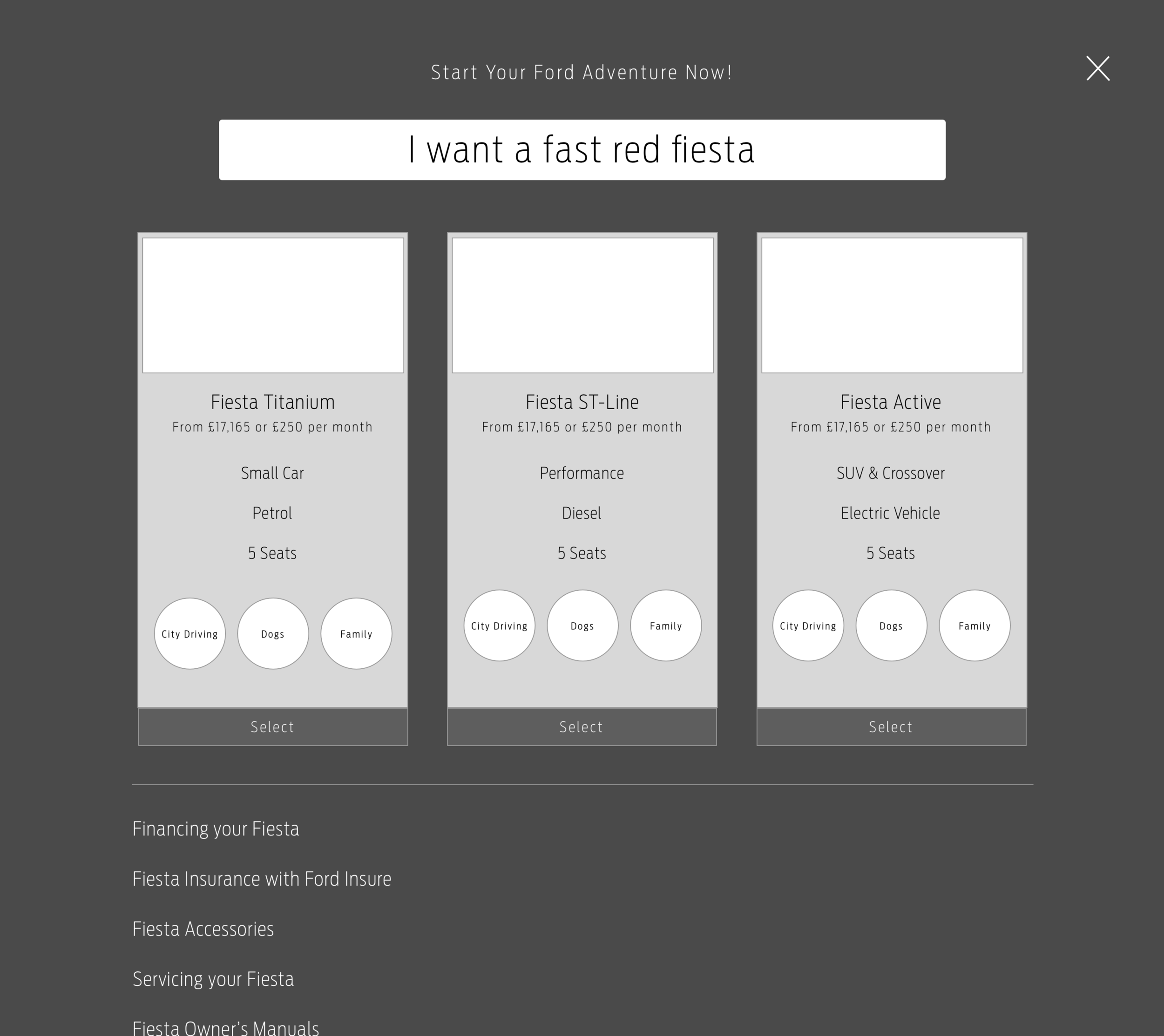
Free text search tool
Product page
The outputs were evolved into tangible concepts, which would be taken through to user testing. Focusing on the facilitation of discovery when looking for the perfect car, the early interviews provided users with effective and engaging entry points into what would be the purchase flow. While a number of concerns had been flagged, mainly around the product page and the inventory, there was now an urgency to begin work on building out the reservation journey that would launch in late 2019.
Key Challenges
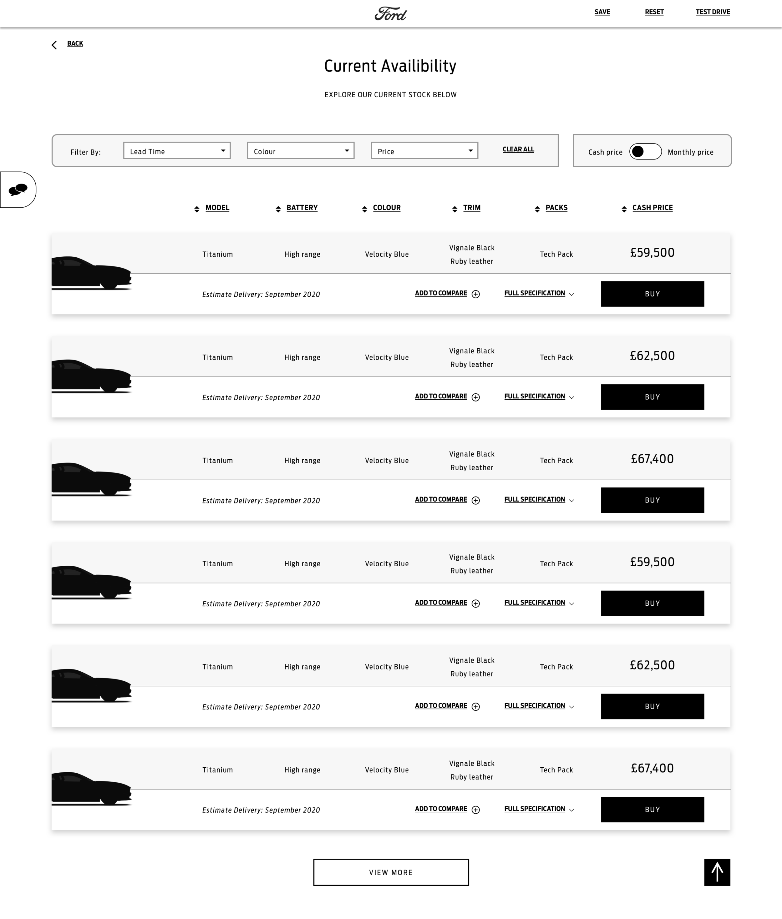
Creating a clear relationship between the configurator and inventory
The inclusion of a live inventory, a feature that would allow the business to sell both new and existing stock, was a requirement from the outset and while we went through months of iterations, users were never really sure what it was and why it was there.
Flow demonstrating the initial placement of inventory vs. the expected placement
Creating a split page that displayed both the configurator and live inventory was an idea that stemmed from the early conceptual work and one we felt would satisfy different customer types. As users built their perfect vehicle, the inventory would update below to display available vehicles matching their selections. Simple right?...
Early exploration demonstrating configurator/inventory page split
Having fixated on a single-screen format for such a long time, I started to be more ruthless with our work and began to separate the 2 experiences out. This change in direction provided a more focused journey and when tested again, users appreciated the linearity of being able to customise their car freely before having to think about proceeding with a stocked vehicle.
The evolution of the inventory based features within the configurator was significant following the initial round of user research
The inventory itself evolved significantly over multiple iterations and was well received. The layout was deemed appealing and clear; however, the page had its fair share of problems. Alongside UI and the design team in the US, I worked to iron out issues surrounding comparability.
A selection of inventory cards demonstrating the amount of iterations they went through to accommodate user feedback, business requirements and available data
Lack of design direction
The Mach-E reservation journey was due to be the first part of Ford’s website that would adopt the all-new 3.0 design system, however, when UI was ready to kick off, there were a limited number of components available. The obscurity surrounding the visual direction meant bringing the UX to life was very difficult.
Ford Design System foundation examples
With the responsibility of leading the UI, I overcame this by developing an indicative UI library that would temporarily bridge the gap between the ongoing work and the official design system release in 2020. Documenting the components in such a way fueled discussions around our design practice, while the indicative kit acted as the foundation to our EU component library, which is now used across multiple projects.
Indicative UI library
Aligning with the user’s mental model
Providing users with an informative journey that they felt confident using would prove pivotal in whether they put their deposit down. Testing multiple iterations highlighted areas for improvement, avoiding confusion for customers using the finished site.
Our perceived flow vs. the user’s expected flow
As expected, affordability proved to be key to the users’ thought process, however it was expected final pricing would not be available for launch. With users raising concerns over its absence, I started to plot how pricing could look across the journey with clear breakdowns replacing the deposit price. This crucial pain point was explored and discussed with the client, which saw the experience launch with indicative pricing.
An indicative pricing summary replaced the original deposit price
The configuration summary was a welcomed part of the journey where users expected to review everything about their Mach-E. User testing indicated that form overlooked functionality. I ensured this was improved upon whilst still meeting business requirements by offering a digestible vehicle spec and pricing breakdown with the ability to explore payment options.
Configuration summary evolution
The inability to test drive the vehicle before making a reservation was often raised by users. Imitating the delight of a new car was explored and recommended, however the lack of content meant options were very limited. The experience launched with interactive 360 images and while this didn’t offer the most immersive experience, it was the best option available. We continued to explore ways to bridge this gap in the mental model with the WebGL due to launch in 2021.
Content limitations were overcome with the inclusion of interactive 360 imagery
The Solution
30%
Increase in configuration completions
5,700
Pre-orders within the first 48 hours
Global Launch
Initially launched in 6 EU markets and North America
The journey, which was the first phase of Ford’s buy online experience, boasted a brand-new configurator that would be adopted by all Ford vehicles by 2022, followed by a reservation flow and order management feature.
Final flow including the post purchase experience
Make it your own
The customisation phase of the experience provided users with multiple options that they could explore sequentially or independently. Users would be able to keep an eye on the indicative cost and take a closer look at the full breakdown. Rendered imagery of the exterior was available, as well as a full 360 of the vehicle’s interior.
Let us help you decide
The inclusion of key data points and features aimed to facilitate a high-level comparison, while the introduction of mandatory steps at the beginning of the configurator experience would break the process up, visually, and would reduce the number of conflicts further down the line. This consideration would benefit the experience when integrating Ford’s full vehicle range.
The finer details
Before progressing into the purchase funnel, the user would have the opportunity to review their customised Mach-E, alongside indicative pricing, and the vehicle’s key specifications. The inclusion of content such as dimensions, infotainment and maintenance would provide further support to help customers who were still unsure of the product offering.
The human touch
The first stage of the purchase funnel required users to select their preferred dealership. Explanatory copy was included to help onboard the user into what was a European business requirement. Visual continuity in the look and feel from the previous step aimed to provide users with confidence when moving through the funnel and avoid a siloed experience.
Make it official
The final steps of the experience required users to provide their details and pay a deposit. While these steps were a formality, the inclusion of components such as the basket summary aimed to install a sense of familiarity. In turn, users would feel assured and confident in what they were about to commit to. Once confirmed, key information and next steps were displayed.
Track your vehicle
Users would be able to monitor their pre-order via Ford’s authenticated dashboard experience. Accessed via the new ‘Your Orders’ tile, key information on the order and the vehicle itself would be available, while users would be able to track their vehicle’s progress.
Reflection
Working with multiple teams over the course of such a large project exposed me to the effort required to bring such a massive product to life. On a personal level, learning to be more self-critical played a major role in the project’s evolution. Leading both the UX and UI pushed my communication and time management skills, while the obscurity surrounding the visual direction tested my ability to take initiative and work proactively to own the visual side of the project.
Next Steps
I worked alongside the US team to develop the full buy online experience, which was launched in December 2020. This release allowed for charging items, accessories, and trade-ins to be added to orders, while customers could submit a finance or lease application. Design updates and smaller features were completed in the meantime, while the next generation configurator began to integrate Ford’s full vehicle range.
Want to see more?
Your Ford. Your Way.
Ford Motor Company | 24 Weeks
Reimagining Wholesale Food & Drink
UK Based Food & Drink Wholesaler | 5 Weeks


